
Although we deal with many new logo conceptions, that same process comes into play when updating an existing business look. Most major companies know the value of doing an image makeover to inspire sales, keep up with the times, or in many cases, eliminate a poorly conceived original.
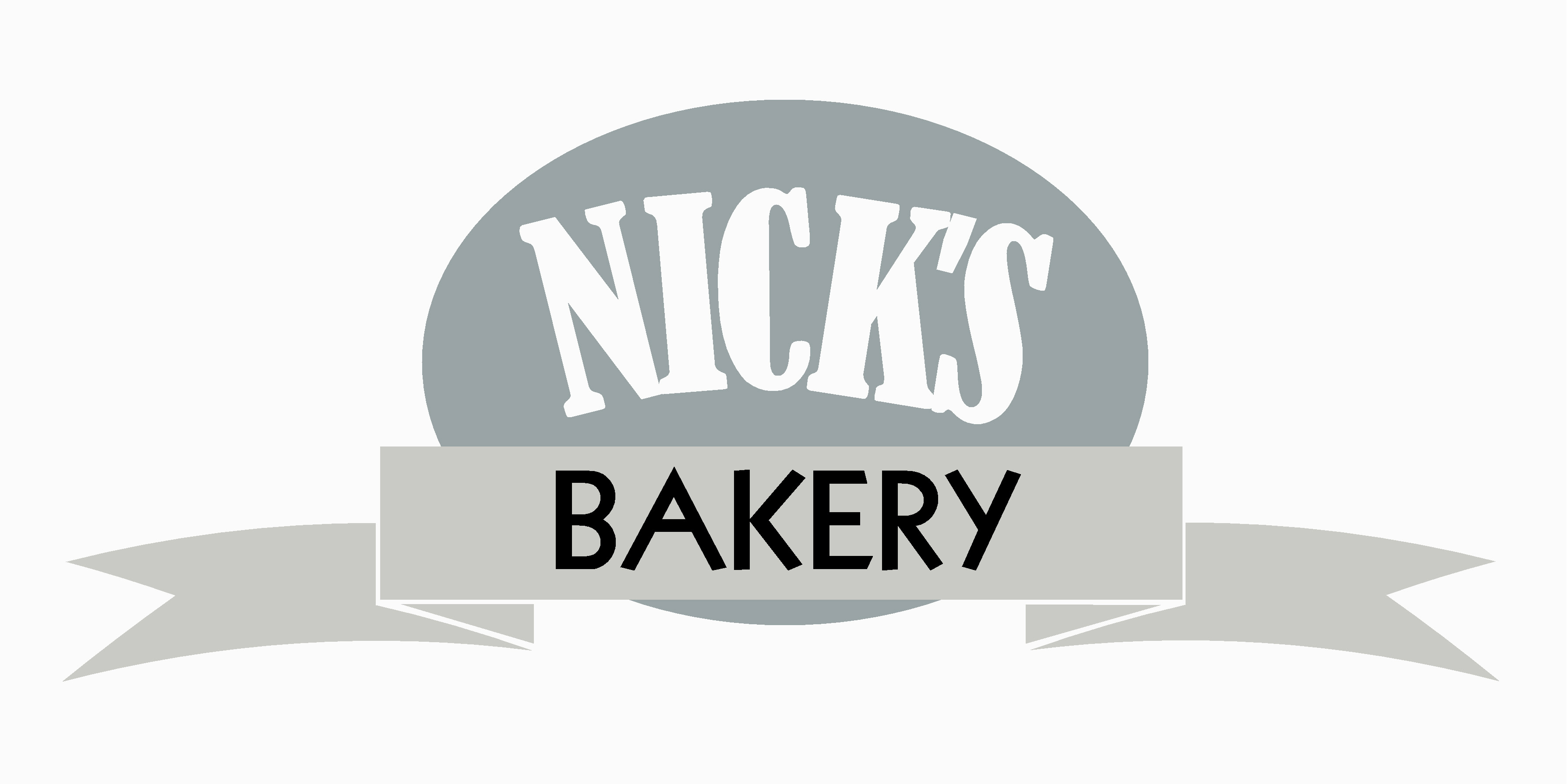
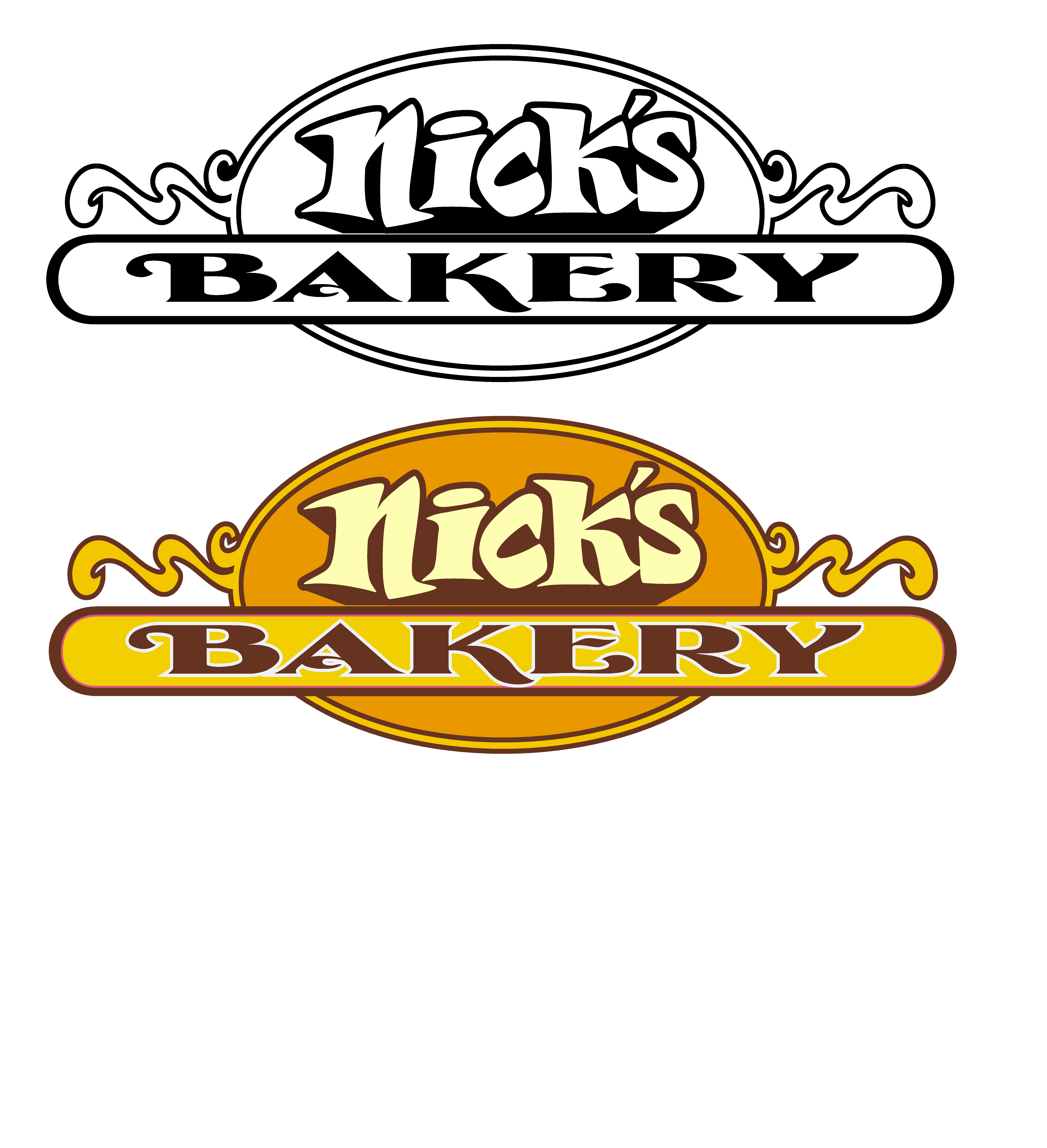
Let’s Use good ole Nick as an example. Nick has a great bakery shop, with plenty of satisfied customers. He went to the local print shop when he opened to get some quick menus printed. He did what many start up business owners do. He paid no attention to how his bakery would be perceived visually by his new customers, being overwhelmed by all the stress and ‘stuff’ that never seemed to end, just to open the door. So the person at the print shop had no supplied artwork, and Nick running out of time, just ‘put something’ together. Problem is the print shop he chose had no talented graphic artist to get his Menus designed with Nick’s great Baked Goods in Mind. So He got a Mechanical looking, generic fast layout .Probably point and clicked on a marginal desk top publishing program. Well, as the years went by, Nick noticed his sales level out, and in some season’s drop. He still got reprints of the same old menu, and even still had his original signage up, that he did himself, thinking he’d save some bucks. Repeat and referral sales were stagnant, and Nick wondered why. The answer is he wasn’t generating new customers with effective ‘branding’ …..How his potential new customers perceived him. Ya see his image was detrimental to positive response and not matching his wonderful baked goodies. We present here how a Image makeover can attract customers and drive sales up. The original was done in color, so when it was printed in affordable black ink, it went to grey tones. To top that, it breaks just about every rule in the book for sound design principles. Way too numerous to list. We hand designed the word “Nick” so as not to be cookie cutter then pumped up the word Bakery. After all that’s what he’s all about. He liked the round thing, so we added some fun scroll work, which matched Nick’s wacky personality. First conceived to work great in black & white, we then went to solid spot color, and finally got out the airbrush to add artistic effects, so he stands out in comparison to most signs you see nowadays. With new menus designed, new business cards, ads and his new signs up, Nick’s a happy camper, with new customers coming in. Nick’s not real, but his story is typical of what we see everyday, in the real business community. Our mission is to supply consistent, refreshing business images, and are able to apply them to all your applications.